The art of lake Ridden is made in Maya and Photoshop, brought to life by Unity.
I’m Erik, the art director of Lake Ridden at Midnight Hub. In this developer blog post I’ll talk a few words about why we decided to go with a more stylized look for our game, as opposed to a gritty and realistic one.
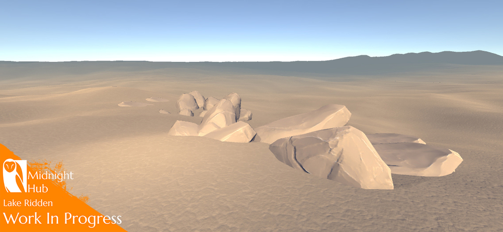
Right now we are in the middle of white boxing and building up the entire backbone of the game.

White boxing the levels for Lake Ridden.
This means that we’re blocking up the whole game in simple shapes to test the gameplay and levels. When this is done we’ll go over the whole game and dress it up with final art. Before we could get started with the white boxing however, we first had to go through a pre-production phase to establish our workflow, pipelines, and explore the direction for the art style. Starting out I was dead set on going for a flat art style that allowed vegetation to blend together seamlessly.

Day 1 of Lake Ridden pre-production, setting up the first rough terrain, woo!
I knew that our forest was going to be very important to the setting of the game and I wanted to get the correct feel right away. However I would soon discover that it wasn’t quite that simple.

Early forest tests, experimenting and trying out various workflows.
Before co-founding Midnight Hub I had been working almost exclusively as a 2D concept artist at Paradox South and Massive. This means that getting back into physically based rendering (or PBR for short) and 3D art proved to be a little bit slow at first. After spending a few weeks trying out different workflows, styles of texturing and techniques I just wasn’t getting the results I wanted, but I was learning quite a lot and gaining momentum.

A little further along, still experimenting a lot.
Meanwhile, as we began scoping the overall project we realized that if we were going to craft a rich and interesting environment for our first person game, in a short enough time, we needed a different workflow. One that allowed us to produce content faster.

First real in-game screen from the build, spooky!
During my exploration with PBR and 3D I had moved away from a more hand painted style in favour of normal map based texturing. After playing a few other horror titles like Silent Hill 2 and Outlast I was convinced that horror games should be using dark, gritty and realistic texturing, as opposed to stylized textures.

The visual style of Outlast.
But now, with a few weeks of testing behind me, and with a short deadline set for the game, I really needed to start using my strengths instead of working against them. My background, after all, is in illustration and concept art.
What finally changed my mind though was the beautiful texturing done by the team of Krillbite studios in their game Among the Sleep. I had previously been blown away by the art of Firewatch, but among the sleep had some wonderfully hand painted floor textures that really caught my eye. Overall a wonderful indie horror game that’s well worth playing.

Stylized art from Among the Sleep.

The tower from Firewatch.
So with this new goal in mind, Johan and I started working on some new ground textures and got a really cool (although really rough) result in just a few hours.

Quick blend test for the ground textures.

Some more work put into the textures…

Experimenting with some stylized grass.
Finally! We now have a style of texturing that’s quick for us to work with, plays to our strengths as a team and, If I dare say so myself, looks rather cozy! I’ll be showing more of the art as we go along. Don’t hesitate to leave a comment if you got questions about the texture work or some feedback!
In the meanwhile tune in on our Facebook or Twitter to follow the progress and see Lake Ridden come to life!
Stay Artsy,
– Erik